Although graphic designers and brand managers should know the answer to the question, “How do brand colors help businesses increase brand value?”, many business owners don’t. So for members of the C-suite with the most vested interest in their company’s success, this article will shed some valuable light on the importance of brand colors.
Branding Color Schemes Do More Than Make Your Materials Look Pretty
Over the years I’ve often heard, “We need your help to make our stuff look pretty” (an expression that makes my nostrils flair). While aesthetics is part of the equation, there’s much more involved in selecting the right colors for your products, services, and brand as a whole.
Brand Colors Meaning
Think about McDonald’s® golden arches, something we can all relate to and visualize. What if instead of yellow, it was gray? Did you wrinkle up your nose? If so, that’s because where yellow conjures up happy feelings that stimulate the appetite, gray, in this context, makes us think of old, spoiled food.
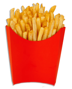
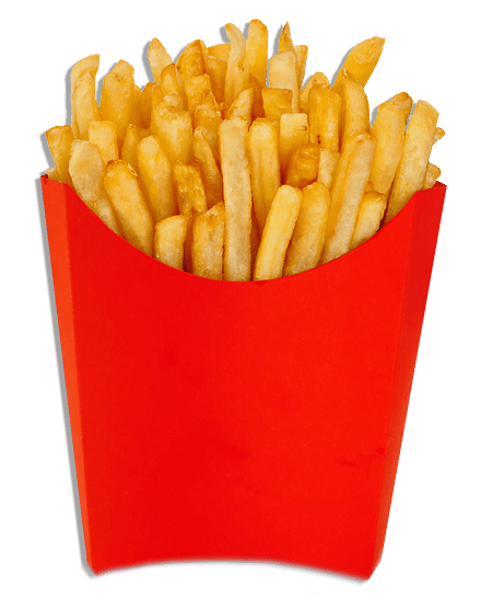
Now think about those large fries you order. They are served in a red container with golden delights sticking out the top (except for the mysterious few that always wind up in the bottom of the bag). Red makes us feel impulsive and hungry. Combine that with yellow’s happy connotations, and it’s no wonder McDonald’s has served “Billions and Billions.”
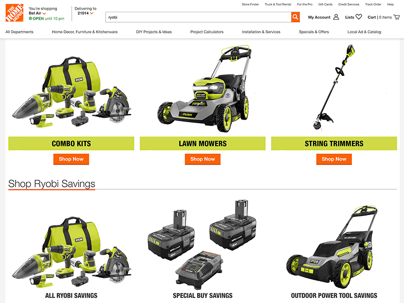
Other prominent branding color examples include IBM’s blue or Ryobi’s green. Picture one of these in a different color. It just doesn’t feel right, does it?
Your Brand Identity Color Palette Plays a Significant Role in How Your Brand is Perceived
Let’s take Ryobi®, for instance. If ever you’ve walked into a Home Depot®, you can’t miss Ryobi’s prominent green packaging and displays.
When introducing their rechargeable lithium-ion batteries, Ryobi switched its brand color to green. And what color do you think of when it comes to lawn care and energy solutions? Green, of course!
Ryobi’s pitch to consumers is that its products offer the most convenient way to transition from gas to cordless for their lawn and garden needs without compromising power (the previous perception from other battery-operated tool manufacturers).
This sustainability value proposition and the fact that some consumers are fearful of gas-powered tools or find them too heavy all play into how Ryobi is perceived. With lightweight, easy-to-use products, it’s no surprise that its website and commercials include and subsequently appeal to women and older adults.
Color Increases Brand Recognition up to 80%!
I can personally attest to the demographics mentioned above (just look in my garden shed). And my yard-fanatic 86 year-old mother will yell for me to “go grab the green leaf blower” after she cuts the grass. Her garage is fully-equipped with Ryobi backup batteries, and she won’t buy anything else. She may not always pronounce the name correctly, but she knows she likes the green tools and won’t buy anything else!
Brand Recognition Plays a Dominant Role in Increasing Brand Value
Companies invest a lot of time and money to create brand recognition. For brand recognition to work, companies need to find a way to help consumers recall their brand, and color is one of those essential visual cues. When comparing similar products, the one with greater brand recognition often results in higher sales, even if both brands are of equal quality.
Brand recognition is also referred to as brand recall – when consumers recall a brand name when it’s associated with an entire category of products. For instance, if you were asked to grab a bandage out of the medicine cabinet, you’d likely refer to it as a Band-Aid®, even if the actual brand name might be “Bob’s Bandages.”
Brand Colors Are Not All Created Equally
With the above foundation in place, let’s get to the importance of having the correct color formulas documented and used consistently.
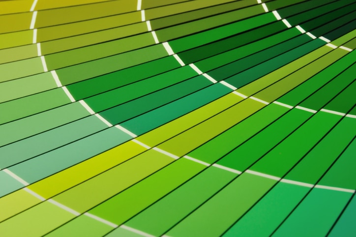
So, how many shades of green are there? Some of you might be thinking, “light green and dark green.” Others may expand their color vocabulary and say, “kelly, hunter, and lime.” The answer is, “it depends.”
It depends on what color formula we’re talking about, and there are several, including:
- PMS (Pantone Matching System)
- CMYK (Cyan, Magenta, Yellow, Black) – also called “four-color process”
- RGB (Red, Green, Blue)
- HEX (Hexidecimal Color)
There was a time when it was easy to say, “OK, I’ll use PMS for printing brochures and HEX for designing my website.” But now that there is digital printing, PMS isn’t always the most accurate formula to gauge the outcome. Sure, you can provide the printing vendor target colors or samples, and there are color converting tools like Pantone to CMYK and Hex to RGB, but there are variables – lots and lots of variables:
- Paper: color, weight, coated vs. uncoated, texture
- Fabric: silk-screened, dye sublimated, or embroidered
- Onscreen: monitor calibration, retina screen
- Light: fluorescent, LED, natural
- File Type: EPS, PNG, JPG
All of the above will impact the outcome of the color, not to mention our aging or otherwise impaired eyesight. For example, we have a client who is color blind and therefore unable to fully ‘see’ red, green, or blue. For this same client, we ran into an issue producing the correct color on his embroidered shirts.
The client had just completed a rebrand – a new logo, tagline, and color palette. The shirts were the first new set of goodies produced because they wanted to show them off at a fast-approaching event.
Well, with brand standards in place, including the proper color formulas and vector art files, what could go wrong?
The shirt company delivered them on time, but the tangible goods had a purple embroidered thread where it was supposed to be more of a cobalt blue, even though the electronic proof we approved looked correct.
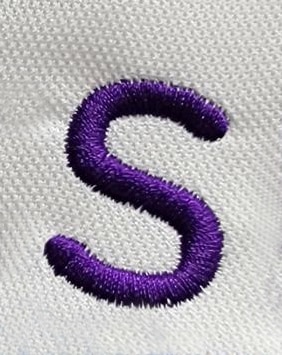
So we were faced with a dilemma. The color blind client was content to wear the purple shirts because he couldn’t tell the difference anyway (his words, not mine). I put the kibosh on that plan and managed to get his team’s shirts with the correct logo colors in time for their event (albeit on a different type of shirt, thanks to the crazy inventory issue the world is facing.)
The moral of the story is that color testing is critical, especially the first time things are printed with a new vendor. After that, you have a baseline for all substrates – paper, hard goods, soft goods, digital, etc. It’s best to provide vendors with your brand standards so your CMYK turns out as expected and to CYA!
Last But Not Least, Protect Your Brand Colors
For many years, a color did not, by itself, qualify as a trademark. That all changed in 1985. After a 5-year legal battle, Owens-Corning, the maker of the distinct pink insulation (some of you may recall the Pink Panther mascot commercials and the related slogan, “think pink”), became the first company in American history to successfully trademark a color. Although their products have evolved over time, their claim to pink holds steady.
Since then, several companies have successfully trademarked single colors, including:
- Tiffany & Co. trademarked its famous blue
- UPS trademarked its “Pullman Brown”
- 3M secured its signature canary yellow color for its Post-it notes
- T-Mobile’s eye-catching magenta is trademarked
- And for you Prince fans, his estate Paisley Park Enterprises) currently has a trademark pending for the color purple (Pantone color “Love Symbol #2”) for use in musical performance.
However, not every company will succeed in trademarking its brand colors, and the time and investment to do so may not be justifiable. Typically, you only see brands do this when the color is critical to the brand, sales, or the product’s marketing (as with some of the examples above).
That said, it is advisable to always trademark your logo to protect your brand.
And when doing so, file it with the help of an IP attorney and do so in black and white, so the trademark protects your logo in all color variations. Therefore no one can, for example, take our Incite CMO “brand police” logo that appears in rusty red, make it blue, and then claim it as their own. Why? Because we trademarked our logo and are protecting our brand!
As you can see, there is much more to brand colors than meets the eye. But once you understand the importance of your brand colors and how to manage and market them, they can contribute to your brand value and bottom line.
If you’re in a brand color conundrum, call the Brand Police at Incite Creative: 410-366-9479 or email us: [email protected].
About Incite Creative, Inc.: Incite Creative is a marketing advisory firm that works in an outsourced capacity. In short, we become your company’s chief marketing officer (CMO) and do so virtually and efficiently — saving you time and money. Since 1999 we’ve had the pleasure of building and boosting brands for a core set of industries. Our thoughtful process, experienced team, and vested interest in our client’s success have positioned us as one of the Mid-Atlantic’s most sought-after marketing partners for those looking to grow their brand awareness and bottom line. Stop paying for digital and traditional services you may not need. Our retainer, no mark-up model means our recommendations don’t come with any catch or commission. The advice we provide aligns with what you need and what fits within your budget. For more information, contact us at 410-366-9479 or [email protected].